Search Box Part 1— eCommerce Accessibility
Search box is shown essentially everywhere to all visitors, it makes sense that you should spend some time making it look nice, right?

To celebrate this year's Global Accessibility Awareness Day (GAAD) I started working on one of my 2021 goals, write more technical notes on eCommerce accessibility.
I will start making an assumption that not a single eCommerce website can live without a search box. It should allow users a way to discover products & categories. Easier than the menu sometimes.
But what makes a search box actually useful? Let's dive in.
Design Principle
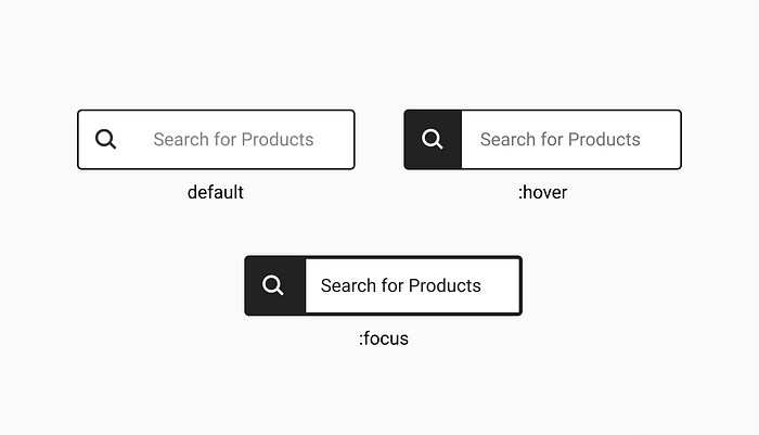
Let's build a search box component that allows you to type characters. and as user types, results are automatically updated showing the top X related products . These are the high level requirements:
- Component should be located on the header
- Should have a label & a magnifier icon
- Should have default, :hover & :focus styling
- It should start showing suggestions after user has typed 2 characters.
(this will be develop in part 2)
Author's note
All of the links in this article will be opening in the same window, as it is the default behaviour of this publishing platform.
I'll try to add as many source references as I can to external documentation on the topic.
A summary and resources will be added at the end of this article.
This component will be using four HTML elements: a form, an input, a button,and a icon.
Autocomplete functionality will described in the next article of this series.
Basic Code
<form action="/search" method="get" role="search">
    <button type="button" class="search-btn" aria-label="Search">
        <svg focusable="false" class="search-icon">
            <use xlink:href="#icon-search"></use>
        </svg>
    </button>
    <input id="search" type="search" name="q" autocomplete="off" autocorrect="off" spellcheck="false" placeholder="Search" aria label="Search for products"/>
</form><svg xmlns="http://www.w3.org/2000/svg" xmlns:xlink="http://www.w3.org/1999/xlink" width="0" height="0" style="position: absolute;">
    <symbol id="icon-search" viewBox="0 0 32 32">
        <path d="M21.6 19.2h-1.264l-.448-.432a10.373 10.373 0 0 0 2.516-6.793c0-5.76-4.669-10.429-10.429-10.429S1.546 6.215 1.546 11.975c0 5.76 4.669 10.429 10.429 10.429 2.601 0 4.98-.952 6.806-2.527l-.014.011.432.448V21.6l6.8 6.8a1.686 1.686 0 0 0 2.383-2.384l.001.001zm-9.6 0a7.2 7.2 0 1 1 7.2-7.2v.01a7.19 7.19 0 0 1-7.19 7.19H12h.001z"></path>
    </symbol>
</svg>
Wow, that’s escalated quickly! Let’s see what all this mumbo jumbo means.
Element 1: Form
<form action="/search" method="get">
...
</form>
The definition of the form element according to MDN is the following: HTML <form> element represents a document section containing interactive controls for submitting information.
Aside from the method of communication method="get" and the url that processes the form submission action="/search" there is one area that's easily forgotten when creating a webpages and that is defining landmarks.
Landmarks can be used by assistive technology to quickly identify and navigate to large sections of the document. For example: header, footer, sidebar, search, banner. This gives shortcuts and guidance to the users of screen readers and some assistive technology on how the page is structured.
The html element<form>default role is "form". In a page we can have multiple forms: login, search, checkout. We can overwrite the role of any HTML element using ARIA to help guide screen reader's users.
The searchlandmark role is used to identify a section of a the page or site. When a <form> is a search form, use the search role instead of form
<form action="/search" method="get" role="search">
...
</form>
This should be our basic code to start creating our search component.
Element 2: Input
To receive the information the user types, we'll use an <input> element. But it has many layers. Let's start with a simple HTML

<form action="/search" method="get" role="search">
    <input type="search" placeholder="Search for products" />
</form>
While creating this component the first decision we are faced is choosing an input type element. Do we use type="text"or type="search". Is there actually any difference between them?
When in doubt I always refer to some of the best documentation in the web (according to me). For any component I like to visit the following resources:
- For HTML / CSS / Javascript: I refer to MDN Web Docs. I like that they include long descriptions, examples, references and browser support.
- For CSS: I like to use caniuse.com. They keep all the browser support up to date, alongside with Known issues.
- For ARIA: I like to refer to WAIA ARIA Authoring Practices 1.1. I love the fact that they have documented & functional components.
- For Design Systems: I typically refer to Government of UK Design System
Let's see the definition of the input element and the different input types according to MDN:
type="text": The default value. A single-line text field. Line-breaks are automatically removed from the input value.
type="search": A single-line text field for entering search strings. Line-breaks are automatically removed from the input value. May include a delete icon in supporting browsers that can be used to clear the field. Displays a search icon instead of enter key on some devices with dynamic keypads. Another worth-noting feature is that the values of a search field can be automatically saved and re-used to offer auto-completion across multiple pages of the same website; this tends to happen automatically in most modern browsers.
Checking the browser support for type="search" (at the time writing this article) it's supported by most modern browsers.

Is it one better than the other? I would have to say no. But since we have an specific element type created for search, that provides with more functionality and it's supported by all modern browsers, let's start using type="search".
Note: I noticed the the Government of UK style guide is currently using input type="search" If anyone from the team is reading this article, I would love to hear from you on the comments.
Placeholder
Form input placeholder attributes are helpful for providing hints to (sighted) users in forms.
The previous code relies in the usage of placeholder to display a the label for the field. This is a violation of WCAG as every field in a form should be labelled (WCAG 2.1 SC 3.3.2).
But why is it important to label input fields? There are two main reasons.
Reason #1: Not every screen reader is capable or reading the placeholder label. Some will use the text in the placeholder to populate the accessible name in the accessibility API. However some browsers will persist this placeholder label even when the user has typed a value, announcing something like placeholder + text or text + placeholderFor example: "search for products shoes" or "shoes search for products". This is not recommended.
Reason #2: For people with cognitive disabilities, distracted users, or simple long from designs with no labels, this could represent a usability problem. In any browser the placeholder disappears as soon as a value is entered into the input, and the user might not remember the label or the description might not be enough for the user to infer the expected value.
There are many ways to solution these issues. I'm going to focus on only two of them.
Solution #1 — Floating labels: Many organizations are moving to floating labels which move out of the field and stay visible when there is a value entered in the input. It is an actual label which is positioned over the input and moved out with CSS when content is in the input.
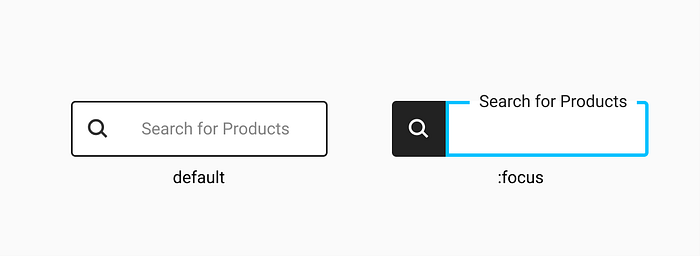
Most designers would prefer a different approach that doesn't require a visual label and keeps the area clean and concise.
One of the 7 principles of Design is pattern: "The human eye is naturally programmed to notice patterns." When speaking about search, it's undeniable that the search engines are the leaders of search patterns. It's their core business. Let's see what the big guys do:



None of these boxes (duckduckgo, google, bing) have a visible label (or placeholder). If we look implementations of eCommerce websites, typically they won't have a label either. Solution #1 — floating labels, is not the appropriate for this circumstance.
Solution #3 — Use a label
Using a explicit label will allow screen reader. If labels are visually hidden, confirm that placeholders have sufficient contrast.
If you want to use a <label>, element there are two recommended ways to go around it. Explicit and implicit labelling.
Explicit labeling
<label for="global-search">
    Search for products
</label>
<input type="search" id="global-search" name="search" placeholder="Search for products">
In explicit labelling the <label> element is sibling of <input>element and the attribute pair "for" / "id" is used to tie both elements.
Implicit labeling
<label for="global-search">
    Search for products
    <input type="search" id="global-search" name="search" placeholder="Search for products">
</label>
In the example above, omitting the for attribute on the label is still valid, but still best practice to include. By keeping the for attribute in place, both explicit and implicit techniques are being combined.
In both these scenarios, the label should be hidden for visually-abled users. The best way to do this is to use a utility class typically named sr-only or visually-hidden. SR stands for screen reader.
.sr-only {
    border: 0;
    clip: rect(0 0 0 0);
    height: 1px;
    margin: -1px;
    overflow: hidden;
    padding: 0;
    position: absolute;
    width: 1px;
}
This CSS allows element to be visually hidden, but announced by the Screen Readers. This utility class is most commonly used in other elements like “skip navigation”. This class should not be used for elements you actually want to hide from the users until activated like a modal or mobile menu.
Solution #3 —Use a aria-label
The most common practice nowadays is to use an aria-label attribute to describe the field, and for visually paired users the placeholder will give them a guidance.
<form>
    <input type="search" aria-label="Search for products" placeholder="Search for products" />
</form>
Note: this does not solves the issue that some screen readers will announce the label + placeholder.
Finally, some of the input attributes are specifically added for the autocomplete functionality that will be explained in more detail in the second part of this series: autocomoplete="off" , autocorrect="off" & spellcheck="false" If you're eager to know more check the input documentation at MDN.
Element 3: Button
It's not required to have a button to operate a search form, especially if when having autocomplete, as it will be capturing the user key strokes using JavaScript and providing responses immediately. This JavaScript can add a listener for the keyENTERto trigger the search.
However it's a nice and recommended practice to allow users to operate the component in multiple ways or as they feel more comfortable. As I mentioned before there are well defined patterns for search, and they includes a search button to trigger the search.
The action of a form, event triggered when submitting the form, can be triggered by a <button>or <input type="submit">.
<input type="submit" value="Search" />If you want to create a custom button and then customize the behaviour using JavaScript, you need to use <input type="button">, or better still, a <button> element.
If you choose to use <button> elements to create the buttons in your form, keep this in mind: if there's only one <button> inside the <form>, that button will be treated as the "submit" button. So you should be in the habit of expressly specifying which button is the submit button.
<button type="submit">Search</button>Both HTML elements are triggered clicking with a mouse or tapping with your fingers, and more so they can also be activated with your keyboard using ENTER or SPACE. I would encourage you to avoid using any other HTML for this purpose <a> ,<div> or <span> as none of these elements are intended to be used in a search box and they will require extra JavaScript & CSS to emulate a button. I would recommend you reading my previous article "when does a button becomes an anchor" (never!)
Regardless of which element is used, the visual design requires that the button doesn't show any label. Actually it requires to show a magnifier icon only. Assuming we chose to use a <button> this is the code to show a magnifier icon using SVG.
<button type="submit">
    <svg>
        <use xlink:href="#icon-search"</use>
    </svg>
</button>
This element in the accessibility tree, doesn't have a label, which again is a fail of (WCAG 2.1 SC 3.3.2).
This time we'll use aria-label to add a label description to the element. Most common names are "search", "go", "submit". When using a Content Management System like Adobe Enterprise Manager, this label should be made authorable and mandatory.
<button type="submit" aria-label="Search">
    <svg>
        <use xlink:href="#icon-search"</use>
    </svg>
</button>
This leads me to the last element of the component.
Element 4: SVG
The best description to make an accessible SVG can be found in this article: https://css-tricks.com/accessible-svgs/
Scalable Vector Graphics (SVG) are the preferred graphic format to use on the web today. Better than font images or using gif, png, jpgs.
I like to include the SVGs inline in the page template, as they have performance benefits. After they are declared you can add a reference to them by <use xlink:href="#icon-search">element inside the SVG.
To make them accessible we need to consider the following: <svg> elements inside focusable elements (like links or buttons) in Internet Explorer default to focusable="true" due to a bug. This causes both the parent element and the <svg> to receive focus.
The focus indicator disappears when the image file receives focus, which is a problem for sighted keyboard-only users. Additionally, some screen readers read the content twice since parts of it get focus twice.
To avoid this problem add focusable="false" to your SVG.
<svg focusable=”false”>
    <use xlink:href=”#icon-search”></use>
</svg>
Read more about focusable=”false” discussion in this github page
Possible enhancements
The following features were intentionally left out of this component, although they can be added as progressive enhancements:
- Voice search
- Show recently typed terms
- Filter by categories
Auto Complete
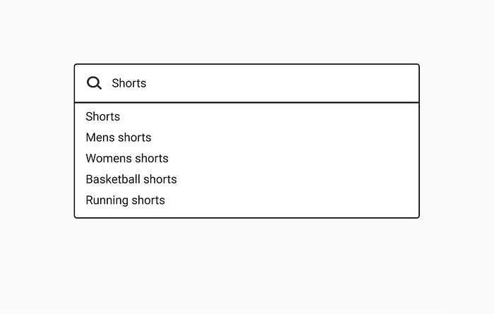
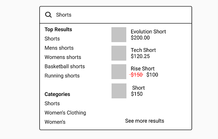
In the part 2 of this article I’ll be writing about the auto complete. Here's a preview of a basic autocomplete and a complex eCommerce specific autocomplete.
Summary & Resources|
- A search box is not a simple component. Even the core structure needs to be thought carefully.
- Make a decision early if you rather use
<input type="text">or<input type="search"> - Make a decision wether you prefer to use a
<button>or<input type="submit" />for form submission - If
<button>is provided for the magnifier icon, label the element usingaria-label - Make your SVG non-focusable to prevent IE issues.
Resources
- Don't use placeholders by Eric Bailey
- How-to use placeholder attributes by Rachel Vasquez
- Input element by MDN
- Form element by MDN
- WAI ARIA Practices
- http://canisue.com
If you have questions or comments, leave me a comment or message me at https://twitter.com/HecOsborneRod
If you want to know more about the motivation of this articles, don’t miss the first article of the series eCommerce Accessibility

